May 2021 Members' Artist Challenge
"The Medium is the Message"
This year's challenge theme is "The Medium is the Message". With the medium of their choice, members tried something new: a new medium, new technique, new surface, new paints or pencils, new tools or products and so on, and shared what they learned with other members. So many possibilities!
Our guest critique and commentator this year is artist and instructor Fiona Ross. Find out more about her at fionarossart.com. Due to continuing Covid gathering issues and restrictions, our Challenge presentation is again virtual. See below for the gallery of our members' art and description of their approach to this year's challenge.
Our guest critique and commentator this year is artist and instructor Fiona Ross. Find out more about her at fionarossart.com. Due to continuing Covid gathering issues and restrictions, our Challenge presentation is again virtual. See below for the gallery of our members' art and description of their approach to this year's challenge.
May 2021 Art Challenge Gallery
Below is our members' challenge gallery of art, with the artists' descriptions.
Click on the art image to enlarge. Enjoy!
Below is our members' challenge gallery of art, with the artists' descriptions.
Click on the art image to enlarge. Enjoy!
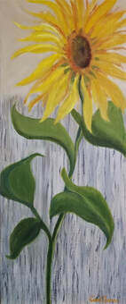
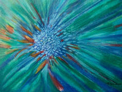 Terry Atkinson, "Renewal"
"Renewal", Oil Pastels, Terry Atkinson
I opted for a new medium, new surface, and an abstract. I was attracted to oil pastels because of the vibrancy of the colors and a friend's encouragement gave me the push I needed to try them. I ended up loving the tactile feel of the medium.
|
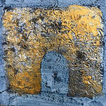
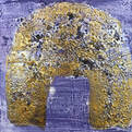
"Uncharted Discoveries I", "Uncharted Discoveries II", Mixed Media, Bev Bley
New to me was using a cradled board for both of these paintings. Also new to me was using aluminium foil as a basis for the shapes, covering them with a medium and dropping large salt pieces into the wet surface which I then painted with gold to give it a rusty look. |
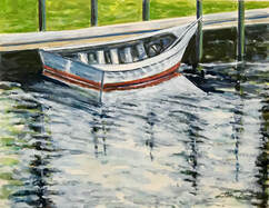 Donna Boone, "Smooth Gliding"
"Smooth Gliding", Mixed Water Media, Donna Boone
I chose to find a medium that might incorporate the spontaneity and looseness of watercolor with the depth of oil painting’s layers of colors and tints. I chose three water mediums to experiment with: acrylic inks, acrylic paint, and gouache. I had used acrylic paint briefly about 20 years ago, but the other two water mediums were new to me. The acrylic ink gave fluidity to the water surface. I used the acrylic paint for solid surfaces – boat, pier, and grass. The gouache, with its dense, non-transparent nature was useful for dark and light highlights. The three mediums gave me freedom to combine three painting effects within the same picture.
I chose to find a medium that might incorporate the spontaneity and looseness of watercolor with the depth of oil painting’s layers of colors and tints. I chose three water mediums to experiment with: acrylic inks, acrylic paint, and gouache. I had used acrylic paint briefly about 20 years ago, but the other two water mediums were new to me. The acrylic ink gave fluidity to the water surface. I used the acrylic paint for solid surfaces – boat, pier, and grass. The gouache, with its dense, non-transparent nature was useful for dark and light highlights. The three mediums gave me freedom to combine three painting effects within the same picture.
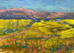 Sally Booth, "Mountain View"
"Mountain View", Gouache, Sally Booth
“Mountain View” was done in gouache, a medium with which I am experimenting. I recently learned that many oil painters were using gouache in the field for quick studies, being simpler to clean up than oils! The honorarium gift card I received for my demo of the Palette Knife Painting in February 2020 I used to buy some gouache paints, including white. The benefits of gouache include cleanup with water and the ability to layer one color upon another color. Adding white gouache to any transparent watercolor creates an opaque effect. I do feel, however, that paintings seem to have a flat look. I haven’t mastered the medium, but like the challenge. I really prefer working in oils!
“Mountain View” was done in gouache, a medium with which I am experimenting. I recently learned that many oil painters were using gouache in the field for quick studies, being simpler to clean up than oils! The honorarium gift card I received for my demo of the Palette Knife Painting in February 2020 I used to buy some gouache paints, including white. The benefits of gouache include cleanup with water and the ability to layer one color upon another color. Adding white gouache to any transparent watercolor creates an opaque effect. I do feel, however, that paintings seem to have a flat look. I haven’t mastered the medium, but like the challenge. I really prefer working in oils!
|
"Beginning Spring", "Frozen Winter", Water-soluble Graphite, Graphitone, Watercolor Pencils, Dalhia Cavazos
I joined a sketchers group and took some workshops to learn to draw better. Working small and in journals is new to me, so are water-soluble graphite pencils, color tinted graphitone pencils and watercolor pencils.What I like about water-soluble graphite pencils is how they react to water with brushes to make shapes. I especially like the pencils without wood; they are great for thin lines and using the sides to make wider marks and shapes. The color tinted graphitone pencils with their more muted colors are great for outdoor drawing and painting. |
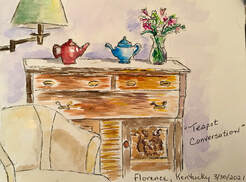 Janice Clark, "Teapot Conversation"
"Teapot Conversation", Watercolor, Janice Clark
I love oil painting and have had little experience in other media. Recently, I was introduced to watercolor journaling. Compared to oils, it is very portable and can be done in a small amount of time.
I painted this entry one morning while visiting a friend in the Cincinnati area. We had not seen each other in 2 years due to Covid. The two teapots represent our dear friendship and our delight in catching up and spending time together. I have taken my journal to many other locations and have truly enjoyed the experience of painting on site. My journal represents all the good times I have had recently. I plan to continue watercolor journaling as it gives me so much pleasure!
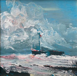 Marla Coleman, "Windblown"
"Windblown", Acrylic, Marla Coleman
My art adventure was to try acrylics for the first real time. Acrylics have always been mysterious to me. Diana convinced me to take a workshop in Golden acrylics. I agreed, paid my fee, and set aside a Saturday for my adventure. I listened, took notes, cringed at words like fast, unforgiving, challenging. I delighted in words like quick, spontaneous, and dynamic.
With paint handed out, I muttered to myself: What the Hell! It’s only paint. Eight or nine swipes later, I sorta quit. Went home. Framed it up and loved my windblown painting. My painting hangs happily at the river now and reminds me of when I stuck my neck out, tried something new, and emerged grateful that I faced the challenge.
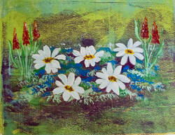 Leslie Corbitt, "Mountain Wildflowers"
"Mountain Wildflowers", Acrylic on Paper, Leslie Corbitt
This painting is new to me because of using a Gelli Plate (8x10). All of the background was done using multiple layers of acrylic paint with different texture items. This was a fun project; I made multiple backgrounds mixed media paper for future use as well. If you haven't tried this product I definitely recommend you should.
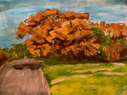 Mike Haubenstock, "Fall Gold"
"Fall Gold", Gouache, Mike Haubenstock
About a month ago we planned a week's vacation with friends at a lake in New Hampshire, and of course I thought about bringing my paints. Traveling with oils can be bulky and messy, and there are wet canvases to transport. So I thought this might be a good opportunity to try gouache. Gouaches are more opaque than watercolors, and still water based. So I bought a starter set of paints. After realizing that there were core colors that I wanted that were not included, I bought some more. So I have been doing some relatively quick paintings to practice with from photo references. Here is one of a fall tree scene. Not ready to hang on my walls, but it has been fun.
About a month ago we planned a week's vacation with friends at a lake in New Hampshire, and of course I thought about bringing my paints. Traveling with oils can be bulky and messy, and there are wet canvases to transport. So I thought this might be a good opportunity to try gouache. Gouaches are more opaque than watercolors, and still water based. So I bought a starter set of paints. After realizing that there were core colors that I wanted that were not included, I bought some more. So I have been doing some relatively quick paintings to practice with from photo references. Here is one of a fall tree scene. Not ready to hang on my walls, but it has been fun.
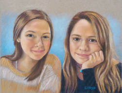 Elizabeth Hood, "Sisters"
"Sisters", Pastel Pencils, Elizabeth Hood
I wanted to learn to use the Verdaccio technique of underpainting in a pastel pencil portrait. In this technique, the face is first drawn using charcoal or sienna pencil in a grisaille technique; next, it’s tonally painted with green pastel pencils and then warmed with yellow tones. Only then are the flesh colors applied, with the goal of creating glowing face tones due to the use of complementary colors that come through the layers of pastel. This technique originated with the early Renaissance Italian fresco painters. The slightly gritty surface of the sanded paper I used was well suited for the many layers of pastel pencil. I was pleased with the results of this technique and will use it again.
I wanted to learn to use the Verdaccio technique of underpainting in a pastel pencil portrait. In this technique, the face is first drawn using charcoal or sienna pencil in a grisaille technique; next, it’s tonally painted with green pastel pencils and then warmed with yellow tones. Only then are the flesh colors applied, with the goal of creating glowing face tones due to the use of complementary colors that come through the layers of pastel. This technique originated with the early Renaissance Italian fresco painters. The slightly gritty surface of the sanded paper I used was well suited for the many layers of pastel pencil. I was pleased with the results of this technique and will use it again.
|
"Sea Creatures", "Ring Around the Water Lily", Watercolor on Yupo, Susan Hutcheson
I have never tried this paper/plastic before and I must say it was a "slippin' and sliding" experiment which I actually enjoyed. The loss of control is a little frustrating but can result in some interesting effects. Since I usually paint in a fairly realistic and tight manner, it was a challenge. Would I use it again, probably not unless the subject matter dictates a loose approach. |
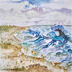 Stella Jones, "Seaside Fantasy"
"Seaside Fantasy", Watercolor, Stella Jones
With this painting, I tried two new things: A highly textured handmade paper from India (Shizen), and the use of stencils. I love the texture of the paper, which helped me achieve a looser, more vibrant painting. I also enjoyed employing the stencils of ocean waves and round shapes of bubbles/pebbles, which simultaneously provided a beginning structure, yet released my imagination to expand on those initial forms. My favorite part was echoing the movement of the waves in the passing clouds, something I might never have tried without the stencils for guidance. I found the whole experiment very liberating!
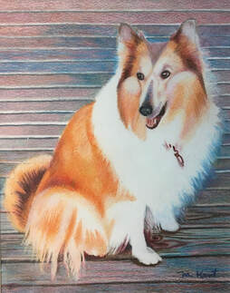 Mary Kent, "Portrait of Angel"
"Portrait of Angel", Colored Pencil, Mary Kent
My preferred medium is watercolor. A few years ago I attended a workshop in drawing with colored pencils. It was fun, and I was pleased with my still life of grapes. One reason it turned out well was that I was given step by step instructions on exactly which colored pencils to use and how to layer them in the right order. Unlike working with paint, you cannot mix pencil colors in advance to see what you get. Pencil colors, however can be blended. To create my own picture, I had to do a whole lot of pre testing with layering different colors in different orders to be confident I was headed in the right direction. Pretty darned tedious, but I’m happy with the results.
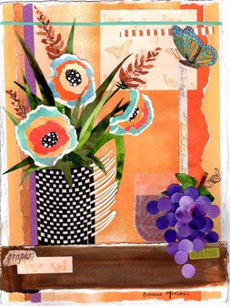 Barbara Mitchell, "Wine and Friends"
"Wine and Friends", Mixed Media, Barbara Mitchell
Mixed Media contained in this painting included:
- Watercolor
- Colored Pencil
- Ink Stamp
- Torn Scrapbook Paper, Watercolor Paper, Wax Paper
- Raffia
- Woven Cardstock
What fun I had doing this! I am a watercolorist but always loved playing with paper. This challenge gave me a good excuse to play.
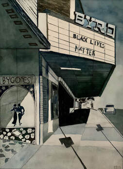 Patty Mochary, "Black Lives Matter"
"Black Lives Matter", Monochromatic Watercolor, Patty Mochary
This is my first monochromatic water color painting. Like the old black and white movies, I feel that it expresses a certain mood. The angular shapes and hues defined by the lines made it easier to try and capture the elements of design.
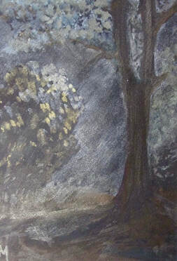 Jan Murray, "Moonlight Madness"
"Moonlight Madness", Watercolor on Black W/C Paper, Jan Murray
I thought the idea of reversing the process of watercolor painting and protecting the BLACK parts instead of the white would be good for my brain, and besides, it intrigued me.
Paint colors were Chinese White, with assorted iridescent, pearlescent and duo-chrome colors by Daniel Smith.
I want to try doing a bright flower, like a yellow iris, next, but will need more paint colors or else try it in gouache. It would be difficult to see lines on the paper, so I will next try drawing the flower using water soluble pencils for the bare outlines and see if that works. It will take some getting used to, but I am grateful for the challenge as it made me haul out my paints.
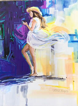 Anne Negus, "Tall and Tan"
"Tall and Tan", Watercolor & Acrylic Markers on Aquabord, Anne Negus
I took this photo of a young lady sitting at an open air bar in Old San Juan, PR. She was tall, tan and lovely, wind blowing her beach caftan. She was lost in her cell phone and oblivious to her surroundings.
1st challenge - I manipulated the image on my iPad by breaking up the background with patches of color, and adding sketchy strokes to show movement of the wind.
2nd challenge - I painted this in watercolor on Aquabord, something new to me. The Aquabord didn’t allow me to get the darker values, so I resorted to using acrylic markers, also new to me, and reworked some areas over the watercolor.
A journey of trial and error. . .this painting is done.
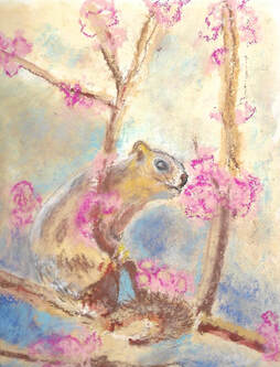 Mary Beth Ols, "I See You Stealing My Birdseed"
"I See You Stealing My Birdseed", Soft Pastel, Mary Beth Ols
I work in watercolor so I chose pastels as my challenge. I enjoyed doing it and I learned a new technique from Rita Kirkman on Zoom, and would like to see more art presentations. I planned to do other paintings in pastel. I always wanted to try pastels but didn't know how to go about it.
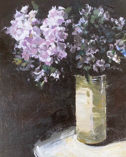 Janine Orr, "Floral Sketch on Marble"
"Floral Sketch on Marble", Acrylic on Canvas, Janine Orr
A floral artist in New York gave me permission to paint some of her stunning arrangements. Painting in oils is usually my medium, but I have been interested in trying some acrylics for the immediacy of the medium and to use as sketches. I also had a box of them going unused from one class I took many years ago.
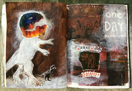 Gwen Parker, "Redivivus"
"Redivivus", Acrylic Transfer Printing/Collage, Gwen Parker
Since the Pandemic started, I've been playing with new techniques; mainly computer-centric. Zoom, Google Classroom, Flickr, Instagram, Google Docs, Procreate, to name a few. My goal being to keep my blood pressure in check when working on the aforementioned programs and my laptop. I have been taking "Zoom classes" on Journaling for the Artist, Art History and Figure Drawing. My Journals have become a record of my experiments. This particular piece started with an acrylic transfer printing technique I learned on Youtube and morphed into a magazine collage. I chose this one because it makes me laugh. BTW the head of the dino is a piece of paper that got caught in my printer and emptied my ink cartridge. Lemonade from lemons, “Redivivus"!
Since the Pandemic started, I've been playing with new techniques; mainly computer-centric. Zoom, Google Classroom, Flickr, Instagram, Google Docs, Procreate, to name a few. My goal being to keep my blood pressure in check when working on the aforementioned programs and my laptop. I have been taking "Zoom classes" on Journaling for the Artist, Art History and Figure Drawing. My Journals have become a record of my experiments. This particular piece started with an acrylic transfer printing technique I learned on Youtube and morphed into a magazine collage. I chose this one because it makes me laugh. BTW the head of the dino is a piece of paper that got caught in my printer and emptied my ink cartridge. Lemonade from lemons, “Redivivus"!
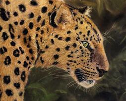 Jan Priddy, "Fixation"
"Fixation", Pastel Pencil & Soft Pastel, Jan Priddy
My choice of medium was pastels. I started with Pan Pastels and then bought pastel pencils to create more detail. I found that soft pastels were an added luxury to experiment with for final fur details and background coverage. The many types of paper were also enjoyable to try. Lux Archival and Pastelmat are my favorites.
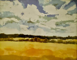 Linda Reynolds, "Broaddus Flats"
"Broaddus Flats", Oil on Canvas, Linda Reynolds
Oil painting is new for me. Done in a one day workshop with Linda Howlett, using palette knives with oils on canvas board.
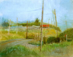 Lois Shipley, "Shore Road"
"Shore Road", Soft Pastel, Lois Shipley
I am primarily a landscape painter who uses water soluble oil paint. Some of my JRAL fellow members make beautiful vibrant pastel paintings that I have admired. Although I have dabbled with pastels before, I wanted to give it another try. I’ve heard these pastel artists discuss surfaces and how one works better than others, but what I had on hand was your standard run-of-the-mill Strathmore Pastel paper. So that’s what I used. As a result, the colors aren’t as vibrant as I’d like, and the lines aren’t as sharp, but overall, I was pleased with my efforts. I liked it well enough that I then painted it in oil... ahh, comfort zone, much better.
I am primarily a landscape painter who uses water soluble oil paint. Some of my JRAL fellow members make beautiful vibrant pastel paintings that I have admired. Although I have dabbled with pastels before, I wanted to give it another try. I’ve heard these pastel artists discuss surfaces and how one works better than others, but what I had on hand was your standard run-of-the-mill Strathmore Pastel paper. So that’s what I used. As a result, the colors aren’t as vibrant as I’d like, and the lines aren’t as sharp, but overall, I was pleased with my efforts. I liked it well enough that I then painted it in oil... ahh, comfort zone, much better.
|
|
"Through the Alps By Rail", Video Animation, Mike Steele
I have always been fascinated by how an artist could bring a painting to life. In keeping with this year's artist challenge of trying a new medium, I decided to teach myself the art of animation. This example is deliberately simple -- it is a learning experience. The painting was designed specifically to be animated, and the animation follows the way I painted it. The inspiration for the subject was the memory of a train trip across Switzerland. The inspiration for the animation was the e-card artwork of Jacquie Lawson. Turn on speakers for maximum effect, and click on the arrows in the lower right corner of the video to enlarge it. |
|
"Robin's Pond in Early Spring", Oil, Nancy Tucker
This small (4×12) oil was done from the need of inspiration as a result of having been in somewhat of a slump. I have been working in oil (I’m never giving up pastel) with Robin Caspari for several years and one day looked at what a classmate had done on her painting with a palette knife and I got excited. Looking out across the pond at Robin's farm, l experimented using solely a palette knife - so fun! I predict more to come. Thanks so much for the needed challenge. |
|
"Whaaaaat????", "Disco Chicken", "Bad Hair Day", Colored Pencil, Deanna Williford
I’ve never done much with drawing this genre of animals or playing around with colored pencils. Then I discovered Carla Sonheim’s book, “Drawing and Painting Imaginary Animals,” and her website with free classes! I was hooked!! These chickens started from contour drawings I did from photos of real chicks. Then adding layers of colored pencil added a real dimension to my new “chickies.” A fun break from my realistic watercolors! (And more creatures to come in the future!) |

